Best edits -
Jan Groover
JAN GROOVER, KITCHEN UTENSILS Jan Groover (American, 1943 – 2011) created her famous Kitchen Still Life in 1978 and 1979. Using a large-format camera, she transformed colanders, knives, spatulas and baking pans into objects of beauty that still hold a visual interest that transcends their common use.

|

|
|

|
My response:
WWW: good depth of field and variation of stuff
EBI: more photos, less blurry would have been better
EBI: more photos, less blurry would have been better
Form over function
Andre Kertesz created the fork image in 1928 whilst living in Paris. Whilst he was in Paris he mixed with artists from the dada movement. The image is deliberately simple. Kertesz is paying attention to the photographs composition. The fork becomes more than just a kitchen utensil, Kertesz believed photography should reveal the real nature of things. Whilst in Paris Kertesz felt like and outsider, Kertesz expressed this loneliness through the subjects of his photographs. He was able to combine formal composition with an emotive charge. Henry Cartier Bresson said "Each time Kertesz's shutter clicks I hear his heart beating".


Best edits -


WWW: good shadows and placement of forks, lighting is good.
EBI: more photos and if the second one wasn't as blurry
EBI: more photos and if the second one wasn't as blurry
My second response -


WWW: Good contrast and sharpness, images are clear and shot well.
EBI: Make sure all the photos are in focus and the whole fork is in frame, make surer the shadows are placed well and try not to get the background in shot.
EBI: Make sure all the photos are in focus and the whole fork is in frame, make surer the shadows are placed well and try not to get the background in shot.
Best edits:

WWW: good depth of field and focus, photos is clear and nice
ebi: if it had a shadow it would be better and if the fork was fully in frame.
ebi: if it had a shadow it would be better and if the fork was fully in frame.
Ordinary to extraordinary
|
Edward Weston used a graflex camera, the camera allowed him to see his subject matter in the right format before taking the photo, he exposed the camera to light for around 4 - 6 hours. He lacked depth of field on f46 so he created his own aperture (f420-pinhole). the movement of light over the course of the long exposure gave the pepper a luminous quality. He developed his own photographic language. it had to be pleasing to him, a master of composition, precise farming.
|

|

|
My response to the Weston


Best edits


WWW: Good focus and good lighting, meets the expectations of what weston's work is like.
EBI: All of the photos were fully in the frame, the light was controlled a little better, more space around the object.
EBI: All of the photos were fully in the frame, the light was controlled a little better, more space around the object.
Edward Weston 2


Best edit -
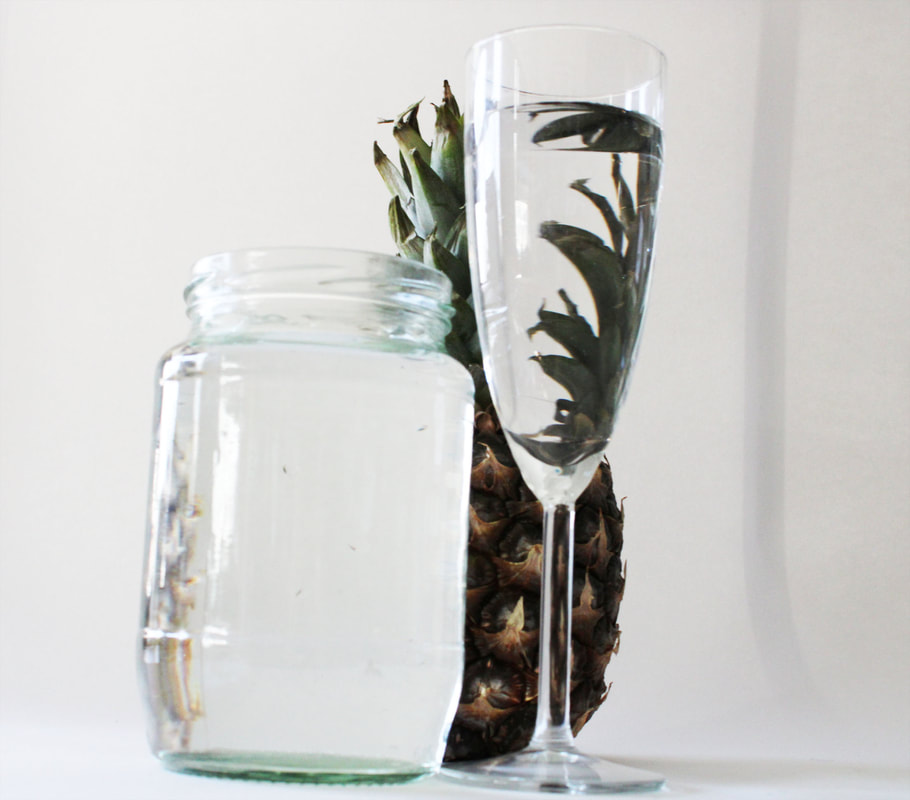
Photo joiners
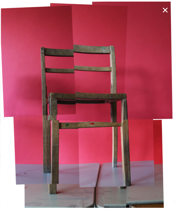
David Hockney is connected to the pop art movement. This movement was interested in responding to popular culture.
Hockney created photo joiners that consisted of photographs taken of the same object from different perspectives. The images were then collaged together to recreate the place, person or object even though the overall appearance may look distorted. This work connects with the cubist movement, one of Hockney's major aims.
Hockney created photo joiners that consisted of photographs taken of the same object from different perspectives. The images were then collaged together to recreate the place, person or object even though the overall appearance may look distorted. This work connects with the cubist movement, one of Hockney's major aims.
Here are some examples of his work -

David Hockney chair photos
|
Hockney Chair
|
My Response
|

|
|
My response-
WWW: The photos merged together very well and all the photos are clear and it is a very good replication of David Hockneys chair photos.
EBI: The chair legs were more in frame.
EBI: The chair legs were more in frame.
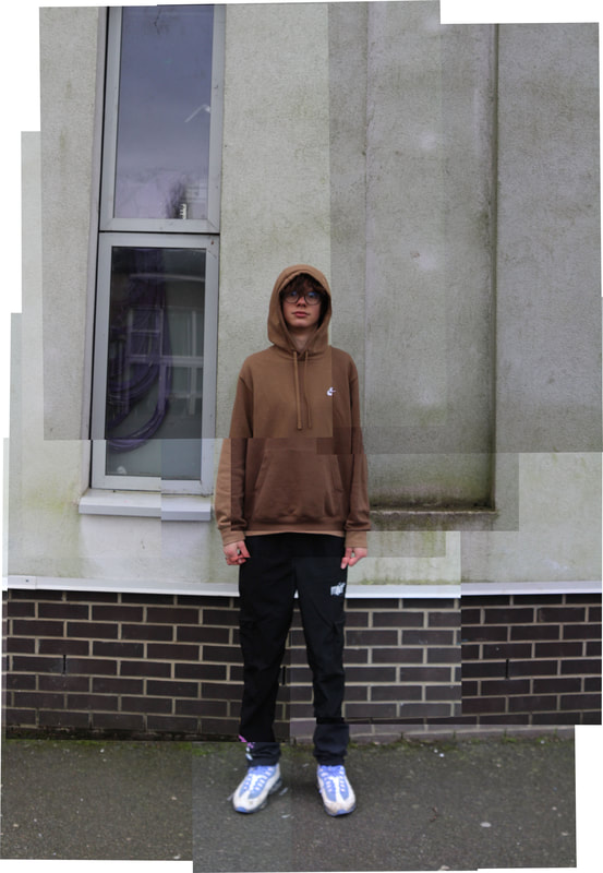
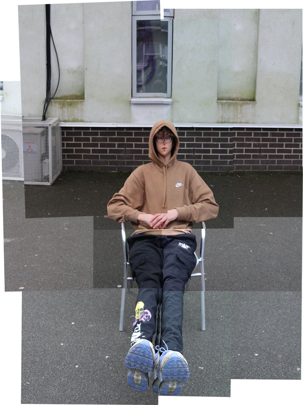
David Hockney portrait photos
Before:


After:
|
|
WWW: photos fit together really well and it replicates David Hockneys work very well, lighting is also good and so is quality.
EBI: the exposure was managed better and his face is clearer in the second one
EBI: the exposure was managed better and his face is clearer in the second one
Eating sequence
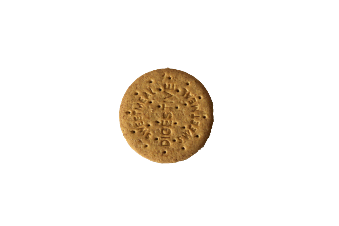
WWW: the cookie stays roughly in the same place and all the photos are clear and cropped well, the bites from the cookie are good as well because they aren't to big.
EBI: better exposure
EBI: better exposure
Uta Barth Photos
Uta Barth analysis: Uta Barth took pictures in her home of light coming coming naturally from the sun and of reflections of shadows, she looked for good contrast of colours in the reflections and made the shadows look good, the way she uses her camera to capture the lighting is really nice because it makes the colours look so vibrant.

In this task i looked for shadows and good contrast and took photos of the areas with the most shadows and shapes in them.


WWW: good shadows and good contrast
EBI: if i had more variety of photos and objects
EBI: if i had more variety of photos and objects
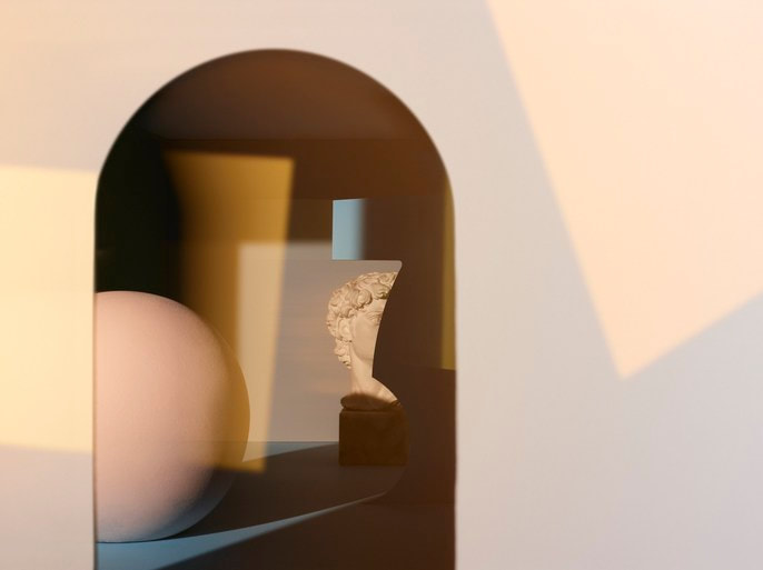
Final development: Light and focus
|
|
The photographer that inspired me is Kate Jackling, her work consists of photographing light and shadows in reflections. She takes the photos in a way where the colours look very vibrant and bright. Ordinary objects are transformed.


WWW: nice variety of colours, the shadows and refractions of the champagne glass are clear and placed well.
EBI: If i cropped the background out and kept just the white paper it would look a lot better. I could have experimented with different angles and focus and even used different glass shapes.
EBI: If i cropped the background out and kept just the white paper it would look a lot better. I could have experimented with different angles and focus and even used different glass shapes.

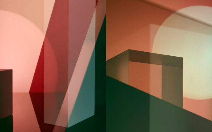
This image is very different to the other because of the colours and the fact the shadows and refractions are very different to the shadows in the other image. I like the mix of the red and blue because they are very opposite colours, meaning they compliment each other well. The focus is a bit off but that can be improved in the next set.

This is my favourite image of the project so far. I like the fade between the black and white to the blue, this is because it adds more colour and life to the photo. I also like the way the glass refracts the light on to the background. I like
